Tuesday 20 April 2010

Overall

Over all I'm very pleased with my music magazine. I have tired my best to make it look as professional and as realistic as i can. By doing as much research and finding out as much information as i possibly can i think i have put together a very well made music magazine.

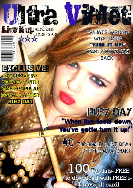
I think my front cover is very different and will defiantly attract the primary audience i want it to be aimed for, as well as a secondary audience that might be drawn to it.


I called my music magazine 'ULTRA VIOLET' because i wanted it to seem very party/club like but the font is what gives it the rock/punk edge.
I chose to use a female model because i feel my magazine should be aimed mostly for girls, because form my research i found that there are a lack of music magazine aimed for girls. By aiming the magazine for girl i hope that it would become the most popular female music magazine.

This particular final front cover was the end out come. I had already made another front cover and then decided to edit and change it until i had exactly what i wanted.


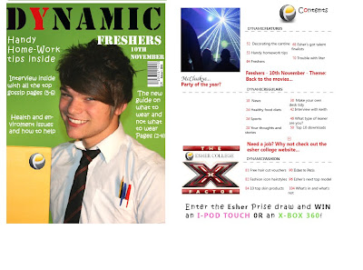
With my contents page like i said i tried to keep its as similar and exciting as 'NME' music magazines contents page. I made sure i used a clear and simple layout because i don't like it when there's to much on the page. I then used only two photos of yet a female model, which is also the main feature in my magazine.
I made the contents page text layout simple as well so its easy to follow and understand.

I'm very happy with how my contents page came out in the end has i had attempted to re-do the contents page more than three times but this was my final.


For my double page spread (DPS) I honestly tired my best to do it as realistic as possible. I really like how my background makes it look very casual and normal, which is the effect i wanted to create.


The interview was a really big hit as well and hopefully it really connects well with my target audience.


I tired to make it look as interesting as possible by including another photo and big gossip secrets and embarrassing moments of the solo artist 'Ruby Day'.


I personally think my whole magazine went really well and I'm really happy with how it all came together in the end. I didn't really have any trouble through out the project although i did have a few moments with photo shop and in design which i soon revolved in the end.


Who Would Publish My Music Magazine?


Because of the style my music magazine is i believe anyone who is into the rock/indie industry would be very interested in promoting and selling my magazine.


NME


The New Musical Express (better known as the NME) is a popular music magazine in the United Kingdom which has been published weekly since March 1952. It was the first British paper to include a singles chart, which first appeared in the 14 November 1952 edition. The magazine's commercial heyday was during the 1970s when it became the best-selling British music magazine. During the period 1972 to 1976 it was particularly associated with gonzo journalism, then became closely associated with punk rock through the writing of Tony Parsons and Julie Burchill.


This magazine company would be an ideal company to help me sell and promote my magazine and they are basically on the same wave length.


Another good music magazine that is also very smiler to my magazine is Karrang. It has a slightly different style on how they present there music magazine but i love how they are very different and bold.


Kerrang! is a rock music magazine published by Bauer Consumer Media in the United Kingdom. The magazine's name is onomatopoeic and refers to the sound made when playing a power chord on an electric guitar.

Monday 19 April 2010

Deconstructing A Music magazine

I found deconstructing a music magazine front cover very useful and gave me a wider range of what I could include in my magazine cover.

The main functions of a music magazine are always the well known iconic features, such as the mast head name, the magazine cover image and the text illustrating the magazine photo. These features are essential to a music magazines because without them we'd have no idea what type of magazine is being presented. For this particular magazine the mast head 'Rolling Stone' was a very famous British rock band, so already there is an iconic feature which is related to music. There's then the actual main feature, the background image of yet another very well know solo artist 'Lady Gaga' with then the text to match.

In my magazine i tried to keep it as similar and close as i could to the 'Rolling Stone' and 'NME' magazine cover theme, because i believed they were the exact style my target audience would want to see. The Style i tired to create was a definite clash of rock and indie, but hopefully it does attract other social groups. as i believe my magazine is very versatile.


With deconstructing a music magazine contents page it really helped with creating my own. i took certain elements of this particular contents page discreetly added them in my own.

i find music magazine contents pages to be much more interesting and more formal than normal gossip magazines. I tired to do a mixture of both music and gossip style contents page i think it appeals to a wider range of people.

Monday 29 March 2010

Target Audience


For my target audience, I have chosen to represent teenagers in a bold, outgoing way, which i think give my magazine the edge teenagers would want to see and read. I have done this by using a very rock chick/punk style photo. To create this certain style I've used a young teenage girl and dressed her in the style of a young relaxed rock chick, which i believe will defiantly attract the type of audience i want.
I don't want my audience to be limited and just be aimed for rock fans, but all other types of social groups as well. I did this because I think it will attract the right audience I have aimed for (16+) and will give off a positive side of what music is about. I've also decided to give my magazine a rough cutting edge look, which will give it a new and fresh look.

The magazine I have produced is initially aimed for 16 to 18, but it could attract a younger audience, rather than an older audience. I say this because of the certain style I have decided to use. The style I have chosen to do is very cutting edge, rock chick, old school looking.
I chose to do this style because, it can relate to everyone. I would say my magazine is very versatile, as it covers most genre's of music. I believe that people would be attracted to my magazine because of the type of style it is and because of the fact it look very different to most music magazines.

Monday 1 March 2010

Introduction


For the first year of Esher college, media, a-level course, we were asked to create and design our very own music magazine cover, contents page and double page spread. We started off by doing a preliminary task, which was to design and create a college magazine. This was a practice run, so that we could get to used to using Indesign and PhotoShop.

After the preliminary task it was time to start on the real piece of course work. For this particular project we were asked to design and create our own magazine front cover, contents page and double page spread. After completing this first task of designing and making our preliminary magazine form cover i felt confident with this task.


The first thing we had to do was to get used to editing and almost redesigning photos that had to be taken by yourself in Adobe Photo shop. Once i was happy with teh photo, i then had to transfer my new edited photo in to a software called Adobe InDesign. This is where you start bringing your front cover/contents page/double page spread to life and start making it look professional by adding different types of fonts other primary photos, text and even more editing to the photo you've already edited.


I found it very hard in the preliminary task to understand how to use Photo shop and InDesign, but after a few lessons of finding what each tool does, i felt a lot more confident and much more adventures.


Through out the whole project i always made sure i referred back to what my target audience wants with in a music magazine. The particular model, Jess, 16, used through out the magazine worked well with the theme and style i wanted to create.

One of the main points and guides i always tried to follow was to always make sure that everything i did was related and in sink to a music magazine and to always make sure i stayed on top of my work so i didn't miss anything out so that i could do everything to the best of my abilities.