Monday, 29 March 2010

Target Audience


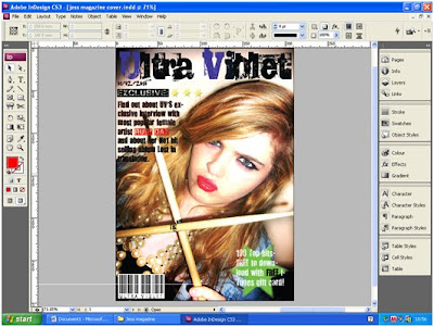
For my target audience, I have chosen to represent teenagers in a bold, outgoing way, which i think give my magazine the edge teenagers would want to see and read. I have done this by using a very rock chick/punk style photo. To create this certain style I've used a young teenage girl and dressed her in the style of a young relaxed rock chick, which i believe will defiantly attract the type of audience i want.
I don't want my audience to be limited and just be aimed for rock fans, but all other types of social groups as well. I did this because I think it will attract the right audience I have aimed for (16+) and will give off a positive side of what music is about. I've also decided to give my magazine a rough cutting edge look, which will give it a new and fresh look.

The magazine I have produced is initially aimed for 16 to 18, but it could attract a younger audience, rather than an older audience. I say this because of the certain style I have decided to use. The style I have chosen to do is very cutting edge, rock chick, old school looking.
I chose to do this style because, it can relate to everyone. I would say my magazine is very versatile, as it covers most genre's of music. I believe that people would be attracted to my magazine because of the type of style it is and because of the fact it look very different to most music magazines.
Monday, 1 March 2010

Introduction


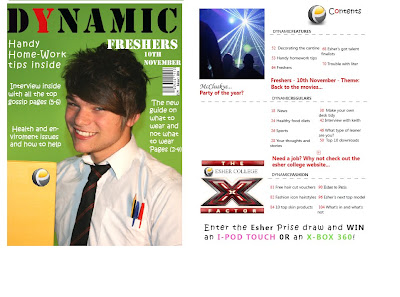
For the first year of Esher college, media, a-level course, we were asked to create and design our very own music magazine cover, contents page and double page spread. We started off by doing a preliminary task, which was to design and create a college magazine. This was a practice run, so that we could get to used to using Indesign and PhotoShop.

After the preliminary task it was time to start on the real piece of course work. For this particular project we were asked to design and create our own magazine front cover, contents page and double page spread. After completing this first task of designing and making our preliminary magazine form cover i felt confident with this task.


The first thing we had to do was to get used to editing and almost redesigning photos that had to be taken by yourself in Adobe Photo shop. Once i was happy with teh photo, i then had to transfer my new edited photo in to a software called Adobe InDesign. This is where you start bringing your front cover/contents page/double page spread to life and start making it look professional by adding different types of fonts other primary photos, text and even more editing to the photo you've already edited.


I found it very hard in the preliminary task to understand how to use Photo shop and InDesign, but after a few lessons of finding what each tool does, i felt a lot more confident and much more adventures.


Through out the whole project i always made sure i referred back to what my target audience wants with in a music magazine. The particular model, Jess, 16, used through out the magazine worked well with the theme and style i wanted to create.

One of the main points and guides i always tried to follow was to always make sure that everything i did was related and in sink to a music magazine and to always make sure i stayed on top of my work so i didn't miss anything out so that i could do everything to the best of my abilities.